
Last updated on August 10th, 2023 at 06:55 pm

In this article, we will cover how to go about analyzing data in Excel.
In life, you will often need to collect, analyze and present data to draw conclusions and plan for the future. Regardless of the field of work, you are in, data collection and analysis are part of the business process. Today as with most other things, this can be done quite easily and accurately using computer application programs. Spreadsheet software is one of the application software that you may use to analyze data.
So if you have a large amount of data from your business operations and wish to analyze the data, spreadsheets are ideal for this. Keep reading to learn:
- How to create a graph in Excel;
- How to prepare a pivot table and chart.
What does analyzing data mean
Analyzing data involves organizing data in tables, sorting, and preparing charts and graphs for easy interpretation. It is a process where we look for patterns – the information that stands out, the highest, lowest, similarities, differences, and even fluctuations.
Create a graph in Excel – create a column graph when analyzing data in Excel
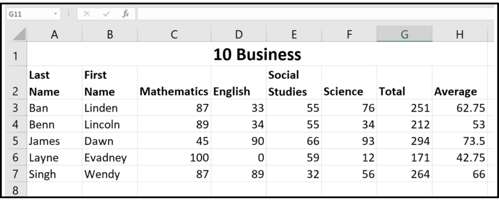
Graphs are one of the easiest things to create in Excel. This ease of use makes Excel one of the best tools for analyzing data. To create a graph, you should first create a table of data. For our purposes, we will use the table below:
Next, follow the steps below to create the chart:
- Select the information in the table that you wish to chart. In this case, we will use the first names, subjects, and grades for the four subjects.
- Go to the insert tab.
- There you should go to the section labeled charts.
- Choose the clustered column graph by clicking on it. To see the name of each type of graph, simply use your mouse to hover over it, and the name will show up.
- The graph should now be in the spreadsheet. Click on the part marked chart title at the top and enter a title for the chart.
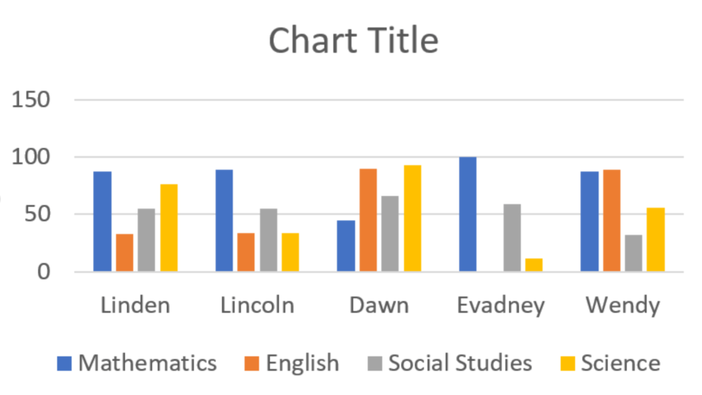
Now by comparing the heights of the similar colored bars, you can compare the students’ performance by subject.
Another tool used when analyzing data in Excel is the pivot table and pivot graph.
What is a pivot table?
A pivot table is a great tool that allows you to easily display a summary of data. They take large amounts of information, group and arrange them in such a way as to bring about easy understanding by revealing trends or patterns.
It is possible to rearrange data in a pivot table without actually interfering with the original data.
Why create a pivot table
Imagine if we wanted to learn which subject in our spreadsheet performed the best. We could take the information above and create a pivot table that would summarize the information to show which subject had the highest grades across the board. This is why we use pivot tables. They would typically give us our totals, averages, and other types of data analysis options.
If you are interested in expanding your knowledge of spreadsheets, our article on absolute and relative cell reference may interest you.
How to create a pivot table
First, select all of the data in the table. Ensure your headers are selected as well. Next, go to your insert toolbar, and in the section marked tables, choose pivot table. In the pop-menu that appears, choose whether you wish to have the table in the existing worksheet or a new one.
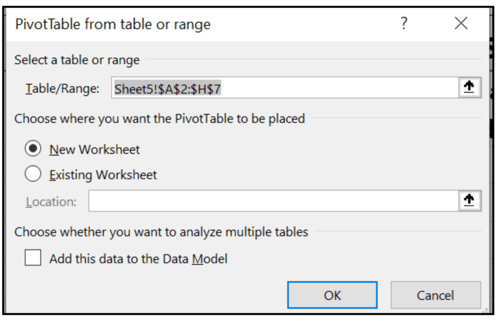
For our purposes, we will leave it as new worksheet. Once you have selected the location for your pivot table, you will be moved to the area where you can select the options you wish to wear in your pivot table.
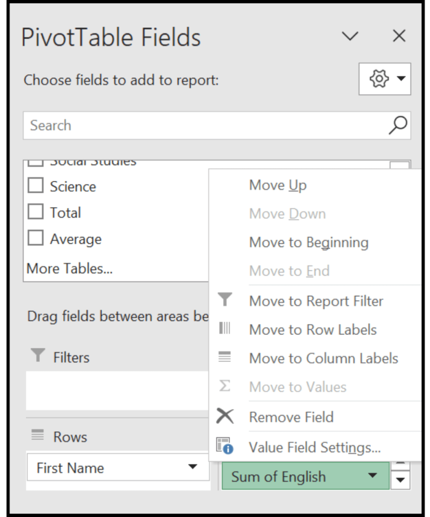
On the right, you will click the checkboxes to make all the relevant data appear in your pivot table. Let’s imagine the wish to compare the students’ performance in Mathematics and English. You should select the students’ first names as well as these two subjects.
That’s it. Your summary of information should now appear in your table.
Alternatively, you can also drag the students’ first names down to the area labeled rows and Mathematics and English down to the area labeled values, and you will arrive at the same table.
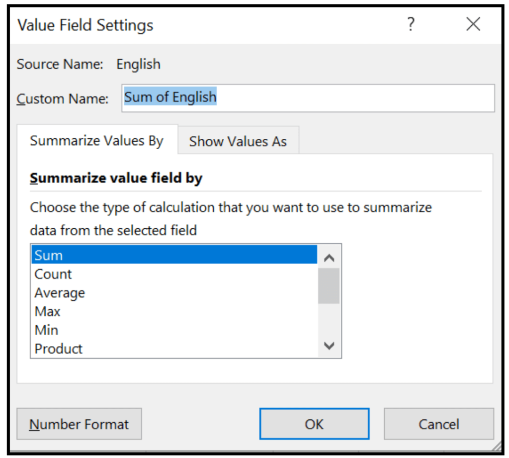
We can also find the average, minimum, and maximum scores er each of these subjects in the pivot table. To do this, we click the value field and then choose the value field settings.
This time in the popup menu, choose min to see the lowest grade for each subject. You also have other options such as average, which will return the average grade, and max, which will return the highest grade for the subject.
How to create a pivot chart in Excel
To create a pivot chart of the information in this table, you can simply select the table then on the insert toolbar, go to the chart section and select pivot chart. On the menu that appears, choose the type of chart you would like to have and then select ok. Your chart will appear on your sheet.
Before you go
We try our best to be as thorough as possible in our information. However, if you have any questions or queries, you may leave them in the comment section below, or alternatively, you may use our contact page. We will respond as soon as possible.